Mobile app

2020 – UX/UI Design

Meet

For this client mission, I had a transversal role of UI and UX Designer, the research part being mainly focused on a market analysis.

Pour cette mission client, j’avais un rôle transversal d’UI et UX Designer, la partie recherche se concentrant essentiellement sur une analyse de marché.

Meet-Header-3

01 context

Challenge

Dating online has become something natural over the years. Millions of people are using the internet to find their soulmate.

But today, the dating application market turned to be very crowded and starts to saturate. However, demand is still there, it is even increasing. Users having a particular appetite for new ways of dating.

It’s in this context that my client wanted a high-fidelity prototype for an investor presentation.

So the goal was to analyze what’s working or not in the dating applications currently available, in order to centralize all the functionalities appreciated by the users in one mobile app.

My role

For this project, I had a transversal role as UI and UX Designer. The research part was focused on market analysis.

main tasks

  • Research synthesis: affinity map from online user experiences, How might we questions (HMW)
  • Ideation: feature ideation and evaluation
  • Sketching: mood board and wireframes creations
  • Designing: prototypes, layout, UI elements, colors, fonts
  • Testing: usability study and user testing

tools

  • Medium
  • Miro
  • Figma
  • Zeplin

02 Design Process

Discover and define

Analyzing the market of dating application allowed me to highlight six essential points and How Might We(HMW) questions:

  • HMW create a safer place, where people can look for serious relationships?
  • HMW encourage people to complete their profile without being too boring?
  • HMW propose matching profile, without having the user to start a search?
  • HMW propose an advanced search with cool features like crush lookalikes?
  • HMW make it easier to start a discussion with a match?
  • HMW propose a gamified experience with trusted profiles?
HMW questions
How Might We (HMW) questions, following the Affinity Map

Ideation and prioritization

I chose to use the Crazy-8 techniques for the Ideation part. This helped me to stimulate my creativity avoiding mental blocks.

This brainstorming session led us to 16 ideas 🤯. In order to carry out the project, we had to make a selection among these, by using a value/complexity matrix. Here are the selected ones:

  1. Show people things they hate in common in priority: 
    commonly hated things create a magical link between humans.
  2. The matching flow has to be central in the app:
    opening directly when it is started and easily findable. It will be the core of the app.
  3. Help to engage discussions once connected:
    showing what you have in common (like/hate) can help to engage the discussion.
  4. Chose lookalikes celebrities crushes:
    by picking-up celebrities, you can help the algorithm to find the right persons.
  5. Use emojis to show peoples intentions (fun/serious):
    emojis allow indicating peoples’ intentions in a friendly manner. 
Feature prioritization with a Value/Complaexity matrix

Sketching & prototyping

I love the sketching part of the process. Not for my drawing skills…, but because it’s the moment when the application starts to take shape. 

Prototype-1
Central matching flow: from sketch to high-fidelity prototype
Prototype-2
Sketches: first iteration
Sketch prototype 2
Sketches: second iteration
High-Fidelity Prototype
High-fidelity prototypes

Usability study

During the user studies, I wanted to test the onboarding flow and the matching flow.

These sessions make me change one major thing: the background color of the onboarding flow. Initially blue, the feedback indicated that blue associated with pink, the main accent color of the app, was too gendered. That’s why I opted for a purple-blue color.

Another big change, done thanks to users’ feedback, was the icon symbolizing the match/play screen in the bottom bar menu. It was initially a heart icon, then a stylized star icon, but both of them weren’t totally representative of this screen. The playing-card icon was finally the option with the best results among users.

03 Final solution

Overall style

In order to build the universe of my application, I did some artistic exploration and research about the dating world. The pink color is omnipresent when it comes to representing love. That’s why I chose a desaturated pink as my accent color. I didn’t want it to be too gendered or too excluding so I used it sparingly. For the overall style of the application, I wanted something elegant and artistic, with clear interfaces. That’s why I chose a light grey for the backgrounds and declination of dark grey + a soft black for the texts.
Meet-Moodboard
Moodboard: Twitch mobile app, Personify font illustration, Work Sans font, Badoo mobile app

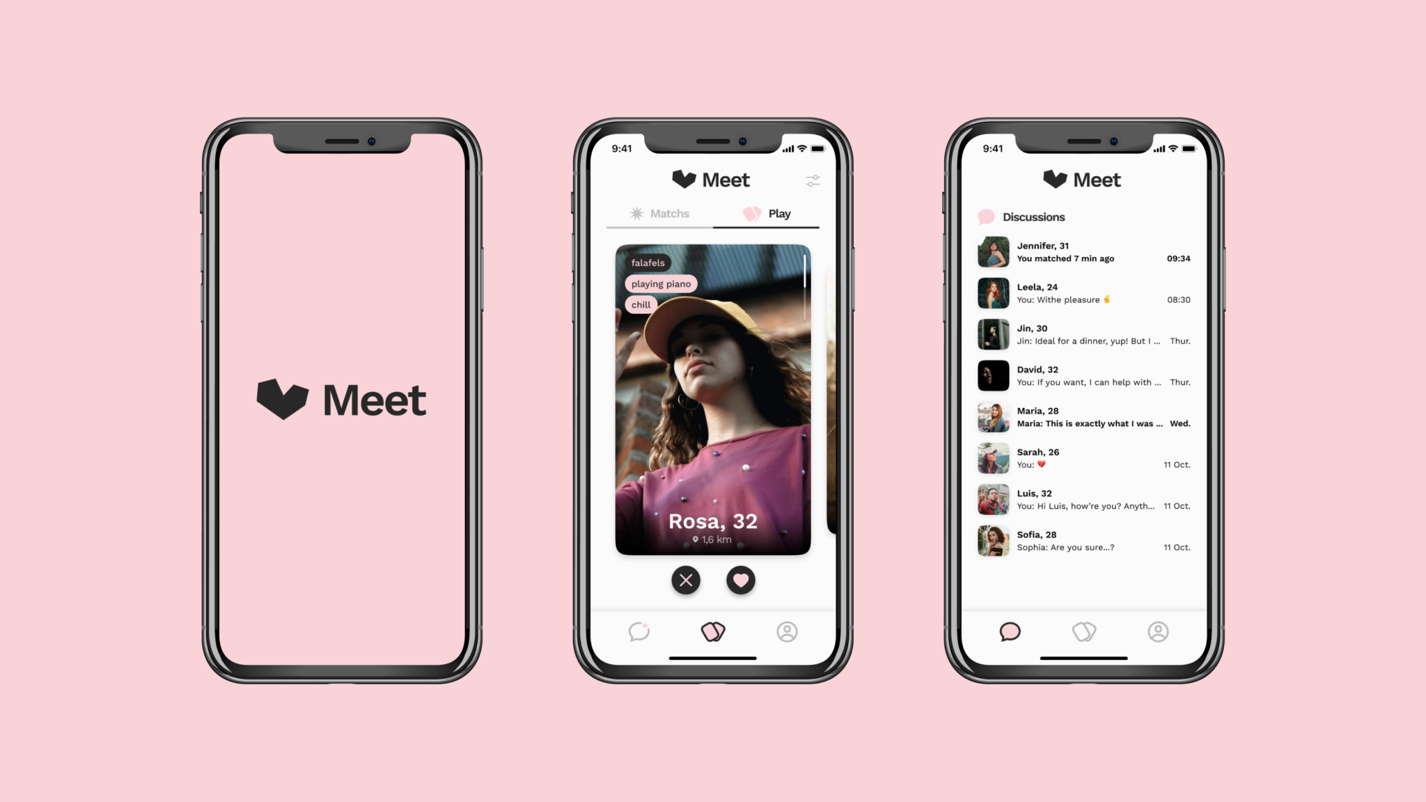
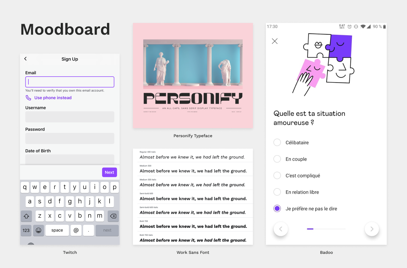
I was very inspired by what Twitch have done with the UI of their app, especially for the text inputs, that I found clear and clean. Badoo was the second main source of inspiration. I really liked the white spaces used in the application, leaving a good place for purple to express itself as an accent color.

For the font, Work Sans allowed me to give a little artistic touch to the app, with its beautiful weight and type-writer inspired characters, while staying optimized for screens.

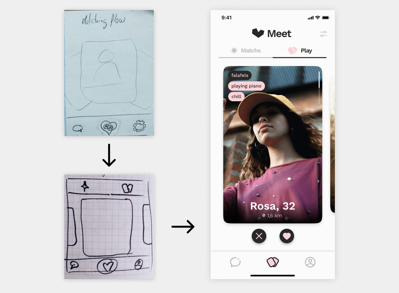
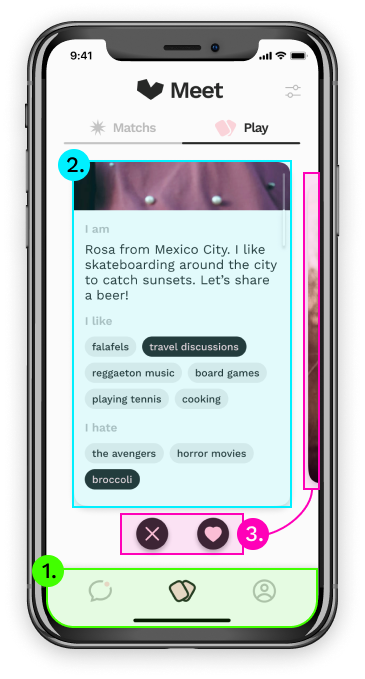
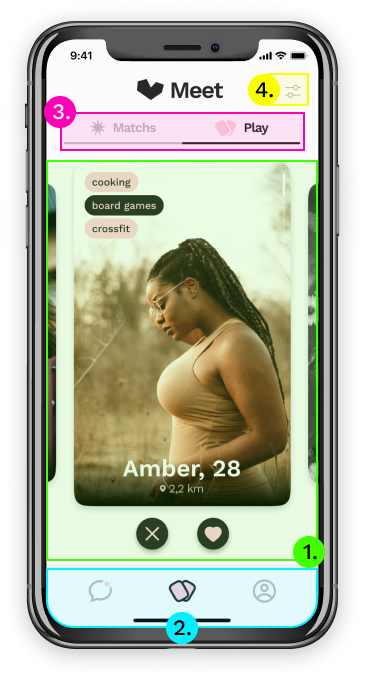
I can also mention the central place of photos in the application, with big ones for profiles and the swipe flow. Or the rounded and soft corners of the components, to offer a fun and playful interface. 

Layout

Meet-Playing-Profile card
  1. I started to build the application around three universes:
    • Match
    • Chat
    • Profile


    I wanted these screens to be quickly accessible in a bottom navigation bar.

  2. A lot of components that I’ve created took the form of a card, like the profile card here for example.


    It allows keeping a roundness feeling, making you want to manipulate it, play with it.

  3. The central matching screens are based on a swiping-card system popularized by Tinder. It’s fun, easy to understand, and maintain the user in a playing flow.

The onboarding screens allowed me more fantasy, as it’s not a type of screen that appears too often, and as it has to be easily differentiated from the standard screens of the app. The style is totally different here, we have a colored background and only black elements. I was in a more artistic approach to UI. 

Meet-Onboarding
Onboarding screens: Profile completion percentage, Selection of things the user likes with tags.

In a dating app, there are plenty of elements to categorize, such as the characteristics of each profile (what people like or hate, what they’re looking for, etc.). That’s why I wanted to pay particular attention to the style of my tags. They took the shape of rounded rectangles, varying from pink to gray, or with black contours. I wanted them to be fun and easy to select.

Hierarchy

Meet-Hierarchy
  1. For a dating app, I think that the first and more important element to see is the profile of other users. It has to be central with most of the screen space. That’s what I’ve done with the profiles playing cards.

  2. As a user, I really appreciate having the freedom to navigate wherever I want in an application. That’s why chose to put a bottom bar menu with the 3 principals section of the app. This is well highlighted and accessible on most screens. I see it as the foundation of the user experience.

  3. On the third level of vision, there is the title of the page. It has great importance on the matching screen as it allows you to switch between “Play” and “Matchs” once you have played enough or when you open the app after several uses.

  4. Finally, I chose to put the search settings less visible, by only putting a small light grey icon in the corner of the screen. I didn’t want the user to focus on it too early as the algorithm should bring good profiles.

High-fidelity prototype

Annnd here it is! The final Figma prototype, following different iterations, thanks to the feedback loops:

04 Learnings

Key takeaways

One of the main takeaways that I learned with this project was the importance to analyze what main UI layout components are used in a specific market. Tinder has “revolutionized” the dating app environment with its swiping card approach, and it’s now difficult to not consider it. 

This project was also a good opportunity for me to improve my grid system knowledge. I worked with an 8px grid, combined with a 4 columns grid. This helped me to manage my sizes and spaces by using numbers multiple of 8. 

Finally, I took advantage of this project to try Figma’s new variants feature. It was time-saving, especially for inputs and buttons.

(Picked up by Design Rush for their Best Dating App Design list)