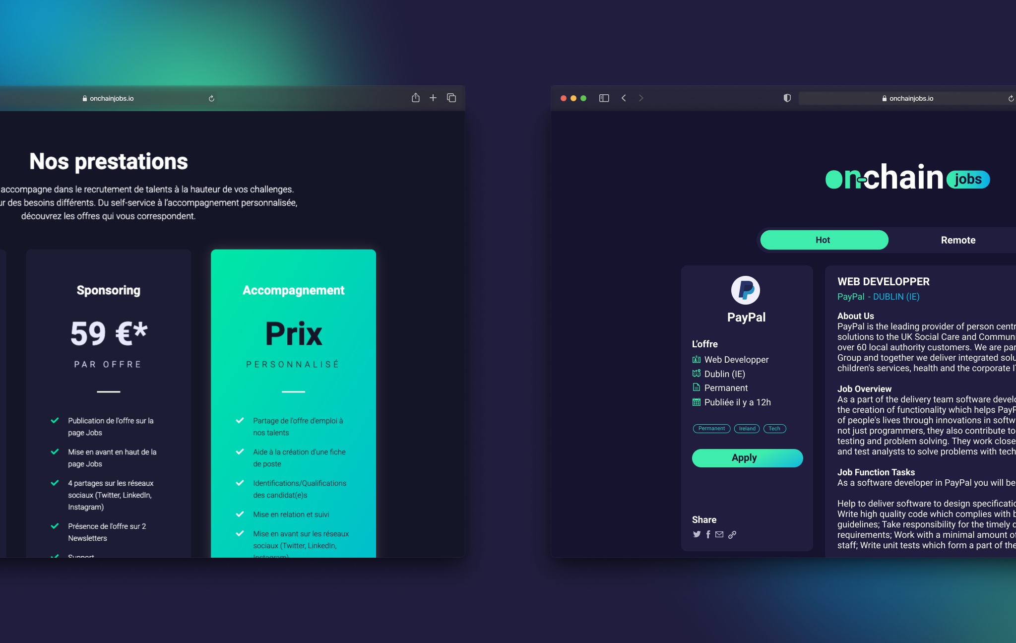
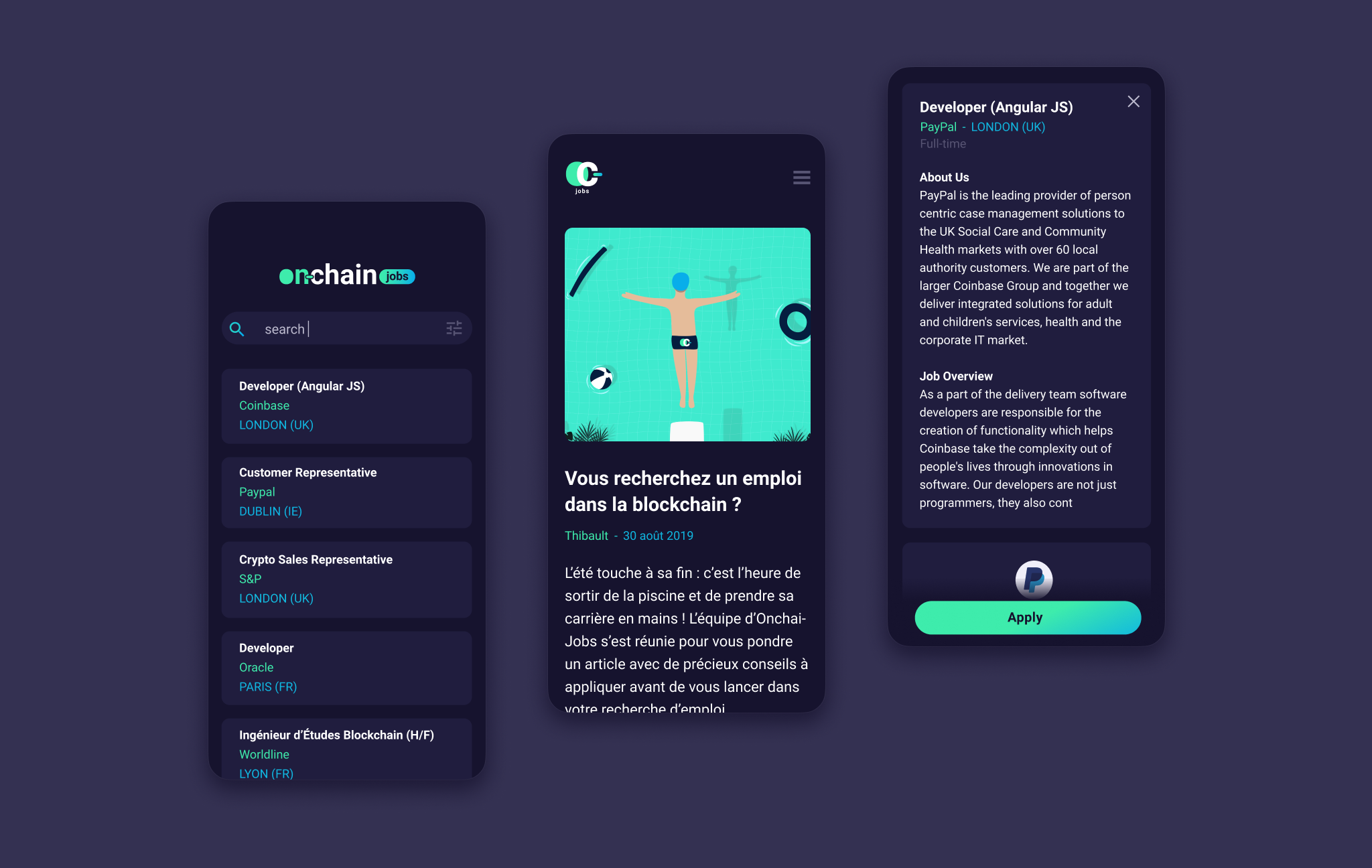
In the continuity of our space and innovation theme, I chose to add rounded corners to our main elements (cards, images, buttons, etc.) to match with our rounded typography. On “modern” interfaces, this roundnesses is commonly used.
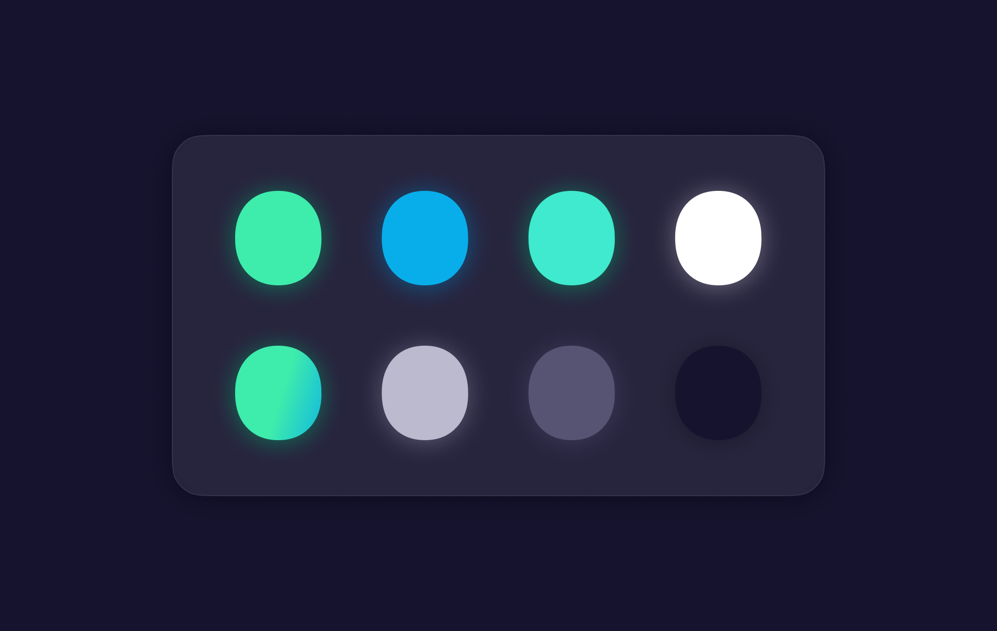
I have added some soft drop shadows, blurred shadows and gradients, to give depths to the elements.

