2020
UX Design

Coffee app study

A mobile application to order your regular café

Udacity-coffee-app-Header

01

challenge

Udacity is an online learning platform that delivers MOOCs, Nanodegrees, and diplomas. They have more than 11,5 million users in the world.

The company planned to open a coffee for its students, and so they wanted to launch a mobile application for its future customers that simplify their coffee ordering path.

 The goal was to link the online ordering journey and the offline drinking experience. 

How? By designing a mobile app offering a personalized experience and the possibility to chose your sitting environment.

02

my role

I led the Product Design - User Experience (UX) and User Interface (UI) - of this project as part of my UX Design Nanodegree diploma.

main tasks

  • Research synthesis: affinity map from interviews
  • Ideation: feature ideation and evaluation, paper sketch
  • Implementation: paper/digital prototypes, usability tests and low/high-fidelity prototypes

tools

  • Miro
  • Whimsical
  • Figma
  • Zeplin
  • Hotjar
  • Google Analytics
Research
Ideation
Implementation

03

discover and define

Listening to coffee drinkers’ interview recordings help me to extract facts, likes, and pain points about peoples’ coffee habits on sticky notes.

In order to isolate similar ideas, I’ve regrouped the sticky notes by themes on an affinity map. That allowed me to detect opportunities for the mobile app project, that I turned into “How Might We (HMW)” questions:

  • How might we propose a creative environment in the coffee?
  • How might we have clients using loyalty cards/programs?
  • How might we propose a collective but isolate environment?
  • How might we create a personalized service?
Affinity map
Affinity map

04

ideation and prioritization

Once I had formulated my HMW questions, it was time to start a crazy-8 session to find answers. The crazy-8 technique consists in generating a number of different ideas within a short period of time, to boost creativity.

All the solutions found weren’t necessarily good or easy to implement. That’s why I had to evaluate them objectively. I used a value-complexity matrix for this purpose, that made me prioritized these 3 principal goals:

  1. Propose a customized interface: users interviewed tend to always order the same thing
  2. Allow to chose work/mood environment: as users tell that they often go to a café to work and look for a creative atmosphere
  3. Centralize data and communication: use the app as a loyalty card for example. Users generally don’t have a café loyalty card but they are sensitive to incentive
Value/complexity chart
Feature priority: Value-Complexity matrix

05

prototyping

The 3 main goals selected, it was time for me to start sketching features, using again the crazy-8 technique.

Sketch ideation was a good step to start focusing our attention on a personalized application approach and environment/mood selection for the coffee client.

The idea of a home screen proposing to order customers’ favorites emerged. I also added the possibility for the customer to chose his environment through its coffee order in this sketching session.

Paper sketch Iteration 2
Paper sketch iteration 2

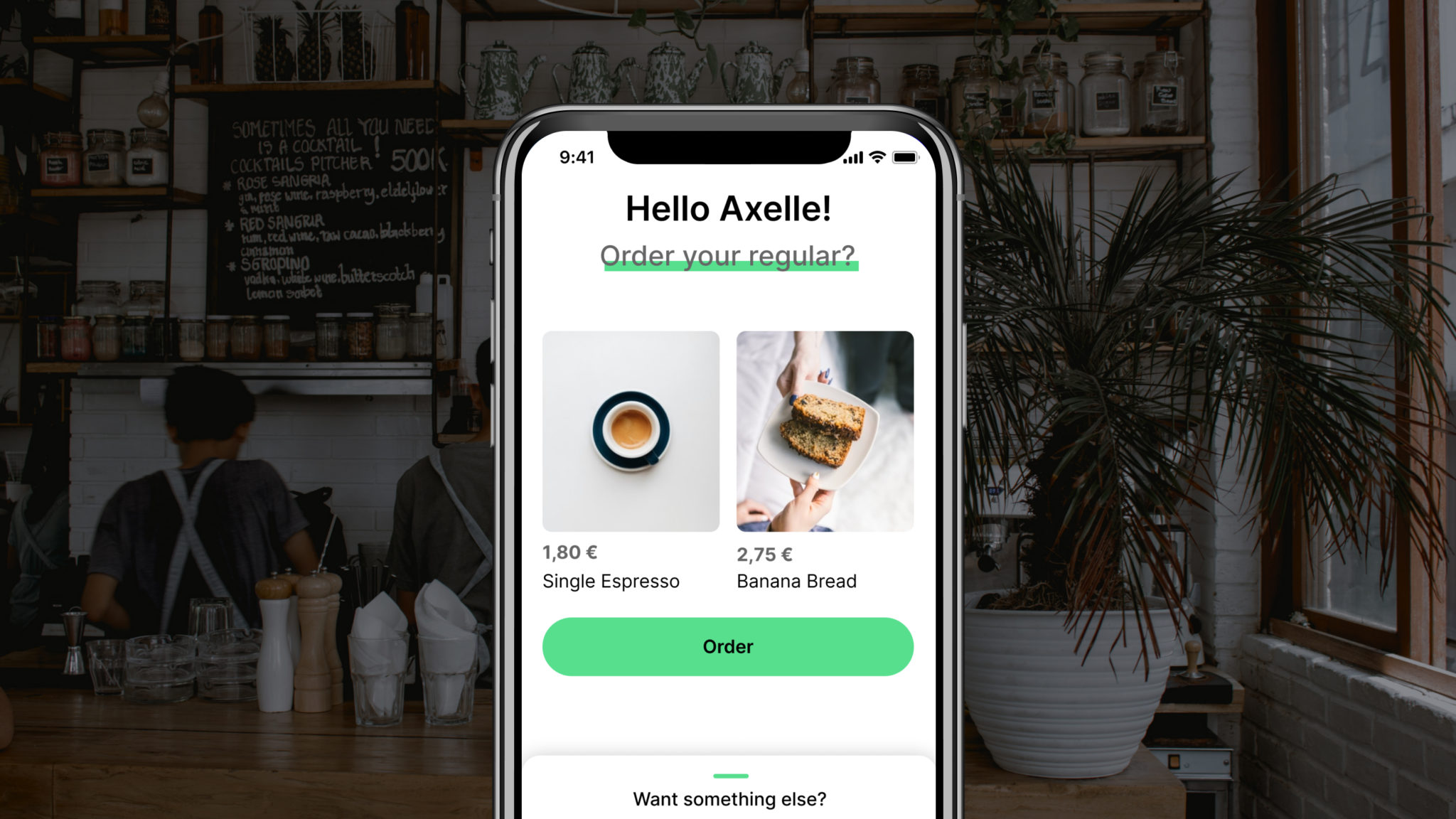
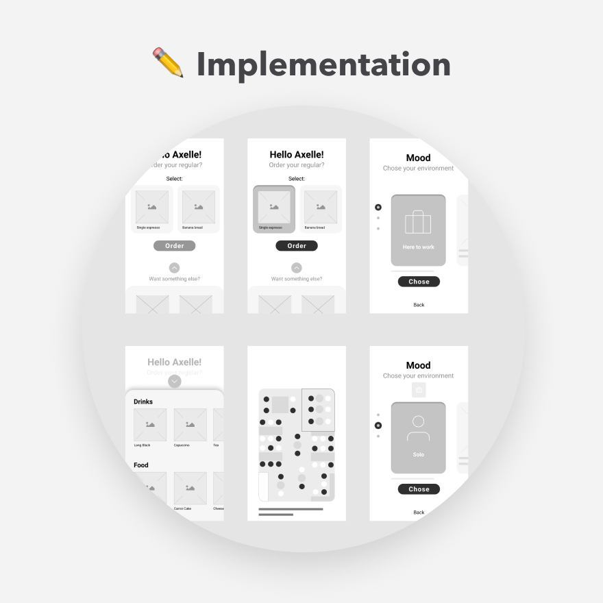
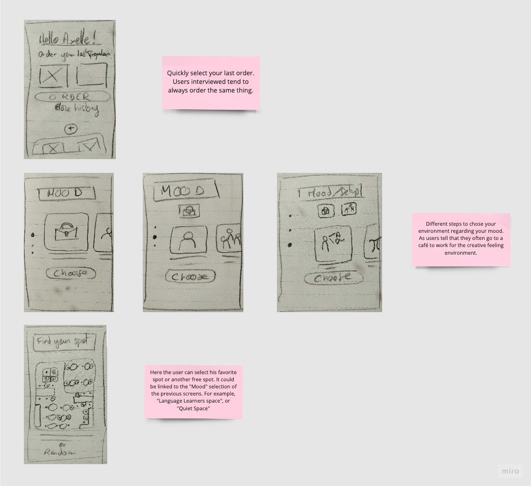
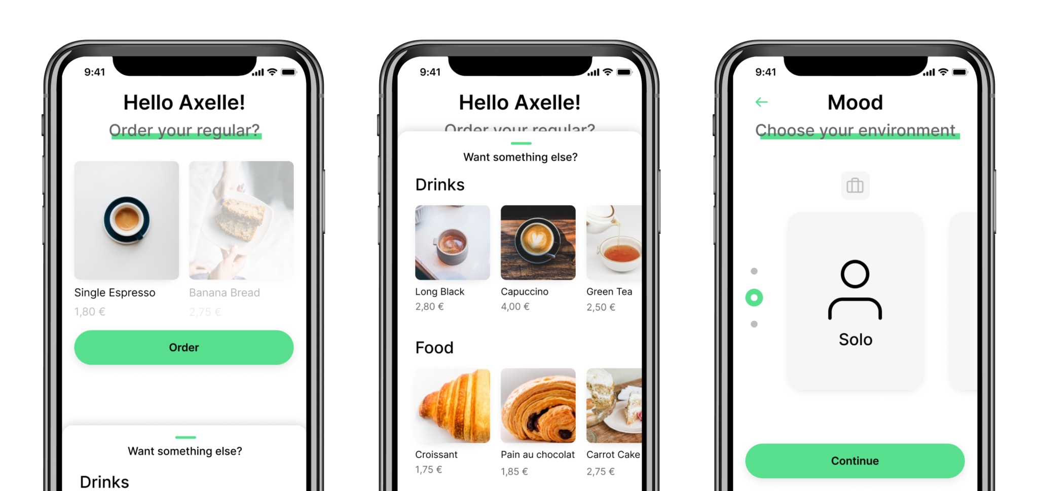
The first ideation of the prototype was composed of one main screen where the customer can quickly order its regular beverage and food, based on their order history. There is also a possibility to drag a menu from the bottom of the screen to have more choices.

Then I provided Environment/Mood screens, that allow the user to select in which environment they want to seat. Working, leisure, or relaxation environment. If the user wants to be on its own or mixed with other people. And finally, according to the previous choices, if the user wants to be in a thematic zone. Like for example in a language exchange corner where people will be louder.  

The last one was sketched in order to let the user chose a free spot where he wants to sit, according to real-time availabilities. 

Digital prototype
Digital prototype on Figma

Once I was satisfied with the paper screens, I turned them into a digital prototype on Figma.

I didn’t want the screens to be too high quality as I needed to validate the flow and usability. That’s why I just placed the elements with some titles and labels but without images or colors.

However, I linked the different Figma screens so the user could interact with it during the tests.

06

usability study

I wanted to see if this digital prototype was easily usable, had issues or pain points. For this purpose, I wrote down some usability tasks, following my design’s flow, in order to do some user tests.  

The tasks were:

  • Understand the home page
  • Select primary items/cards to order
  • Visualize secondary items/cards to order
  • Navigate in the mood/environment
  • Select items in the mood/environment

Leading some usability tests enlighted some crucial roadblocks and pain-points. For example a lack of text information, some confusing CTA or bad contrast ratios for texts and buttons.

The main insights were:

  • Primary items selection on the home screen is not 100% clear due to the style
  • The dragging menu on the bottom of the screen is often skipped or not seen
  • Text of the “Choose” button is not clear enough to understand that this will lead to a second step of the Environment flow
Usability tasks report from a user interview

07

high-fidelity prototype

I’ve learned a lot during the usability test sessions and so I had enough information to work on a high-fidelity prototype through Figma. So it was time to try some style and color exploration to bring this app prototype to life. But before to go too further in designing the screens, I needed to focus on a major topic: accessibility.

Accessibility has always been important in design so that most people can make the best use of an application. This is truer than ever today. By taking some time to rate accessibility on my screens, I saw some important “mistakes” like the color contrast ration on my green titles and labels, or on my CTA button.

Accessibility Improvements

08

solution and impact overview

Finally, I got a simple and customized coffee ordering application, allowing loyal customers to quickly order their regular coffee and choosing the best spot to enjoy it.